T-Charts
Home | Articles | Productivity | T-Charts Log in | Sign up
T-Charts are used in education, research, problem-solving and decision-making. They are helpful when comparing two concepts, listing pros and cons, outlining arguments or organising data for analysis.

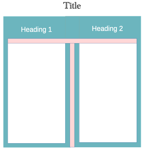
As you can see from the above template, a T-chart has a title and two columns (Heading 1 and Heading 2). The columns list information that is relevant to the subject.
T-Charts are often described as simple tools. Their structure is simple, so why was I having difficulty understanding how to use it? The answer was that T-Charts can be used in several different ways. For example:
- Topics and Information
- Pros and Cons
- Comparisons
- Education
Topics and Information
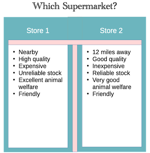
This T-Chart displays information about a supermarket.

Pros and cons
In this example, a T-Chart helps you decide whether to shop at a particular supermarket.

Comparisons
Supposing you wanted to choose between two supermarkets. T-Charts are a good way of comparing the characteristics of both stores.

Education
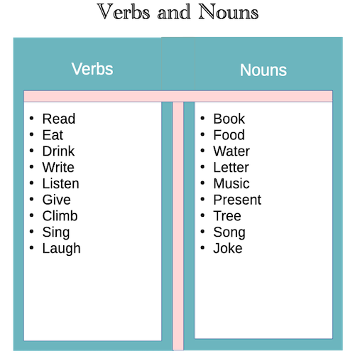
T-Charts are useful in education. The example shown here helps students understand different parts of speech.

Limitations of T-Charts
Although T-Charts are very easy to make and can be used in several ways, they do have some limitations:
- T-Charts can only compare two topics.
- They often fail to depict more complex relationships between multiple variables.
- They are less of a graphical tool and more focused on grouping or comparing things.
- T-Charts can’t build up or devise a lot of information or relationships.
- While they are good at depicting real-world examples, they often fail to represent hypothetical situations or mathematical formulae.
